What is a Responsive Website?
Responsive is Mobile Friendly. Responsive web design builds homepages that“responds to”or resizes itself depending on the type of device it is being seen through. A responsive website can be displayed on multiple devices correctly such as desktop computers, laptops, mobile phones and tablets.

Why is Responsive Design Important?
Having responsive website is a must. Go responsive!
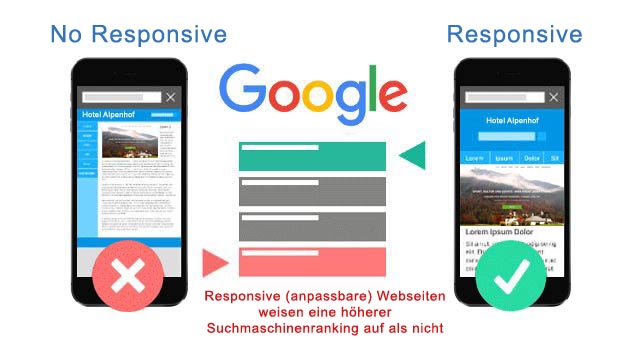
Responsive Design is Preferred for SEO
Google prefers responsive web design. Responsive websites will perform better in search rankings because they provide a better user experience than sites that are not mobile friendly.
One site is easier to manage.
One website for all devices! A responsive site will adapt to each device and your business will only have one site to manage, you'll only have to update content one time, That saves time and money.
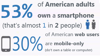
Mobile Usage is Exploding
- Over 20% of Google searches are being performed on a mobile device.
- More than half of the local searches were performed on a mobile device.
- 61% of people have a better opinion of brands when they offer a good mobile experience
Responsive Adapts to Future Devices
For responsive designs, it does not matter what size screen someone is viewing your website it will display properly for that screen size. So in the future as new devices (TVs, watches, etc.) are used for web browsing, your responsive site will still look beautiful.
Positive User Experience Is Key
If a user lands on your mobile website and is frustrated or doesn’t see what they are looking for, there’s a 61% chance they will leave immediately. If they have a positive experience with your mobile website a user is 67% more likely to buy a product or use a service.
A Speedy Responsive Website is Key
The content of a responsive website loads faster on a mobile device. It is typically not possible when loading a desktop website on a mobile device. When a user has to wait too long for a page to load, there’s an extremely high chance they will leave your site.
52% of all local searches are performed using a mobile device
3 out of 5 total searches are performed using a mobile device
99% of smartphone users use their mobile browser every day
9 out of 10 mobile phone searches result in a purchase or visit
1/3 of all organic search traffic comes from smartphones and tablets
68% of mobile users leave your site if it’s not mobile-friendly
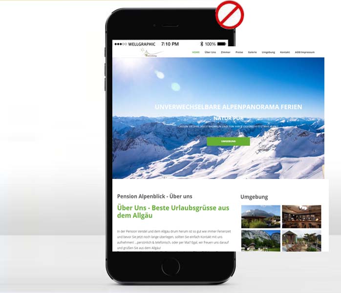

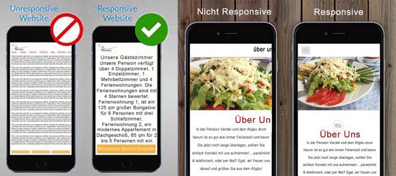
Unresponsive website’s text are hardly readable on mobile devices. It’s either way too small or way to big.
That’s because it wasn’t designed to fit the mobile device screen,
it was designed to fit a desktop computer monitor screen.
The
Responsive technology automatically detects whether you are using a desktop computer, an iPad,
or a smartphone and it automatically displays correctly across all devices and platforms.
The overall layout including especially the Navigation part are well
responsive to different devices.